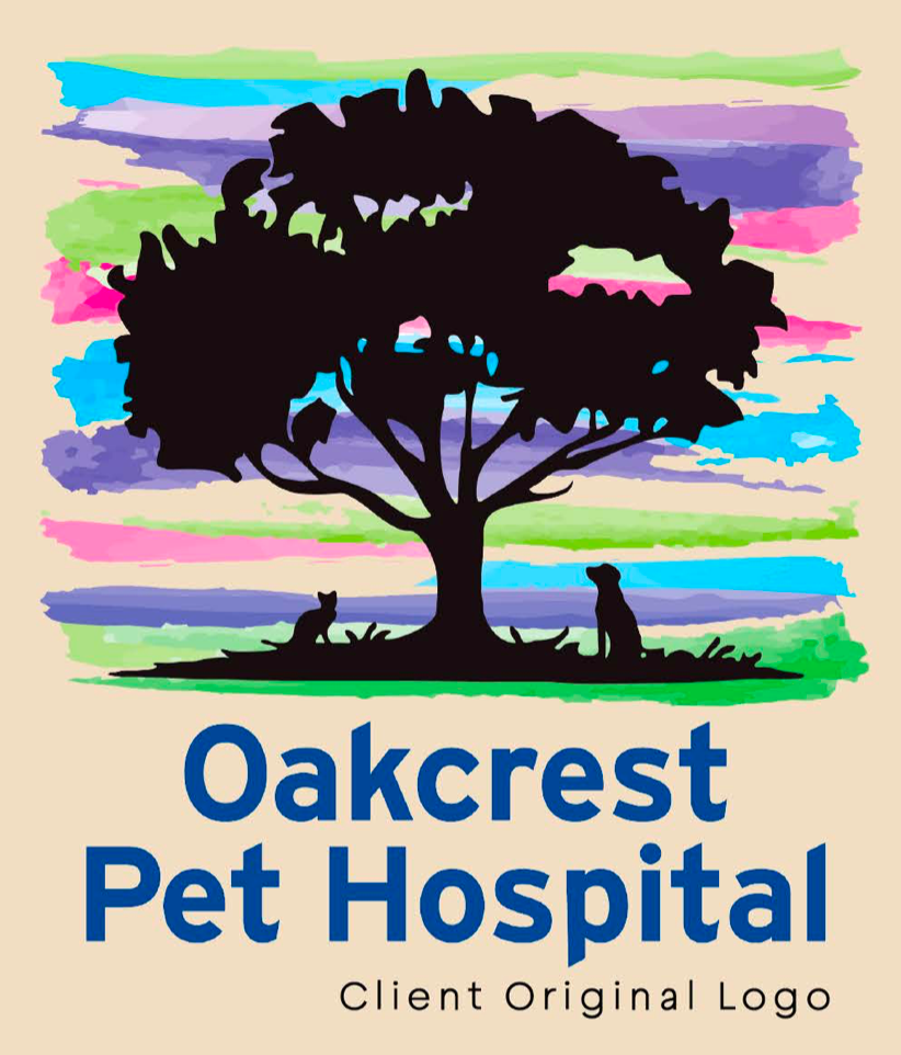
Oakcrest Animal Hospital is a vet office in Wichita, KS. My primary goal for this business was to create a more modern identity.
I wanted to bring more animal iconography to this business, while also keeping the oak tree iconography.
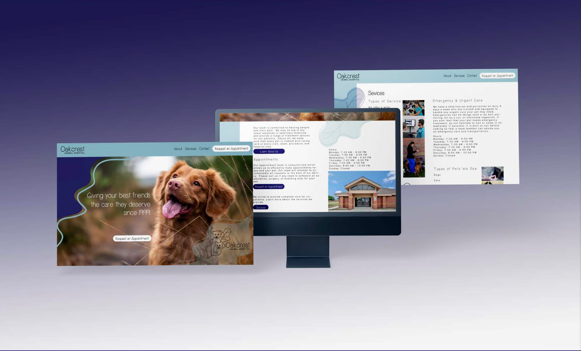
The website also did not feel like a vet website and the color scheme did not fit well with the existing logo, so that was also one of my goals for this brand.
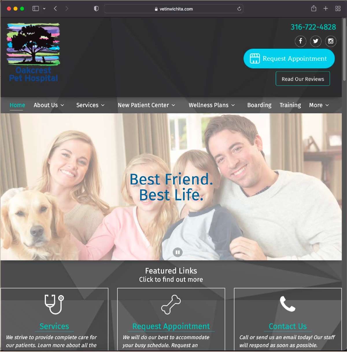
Client Original Web
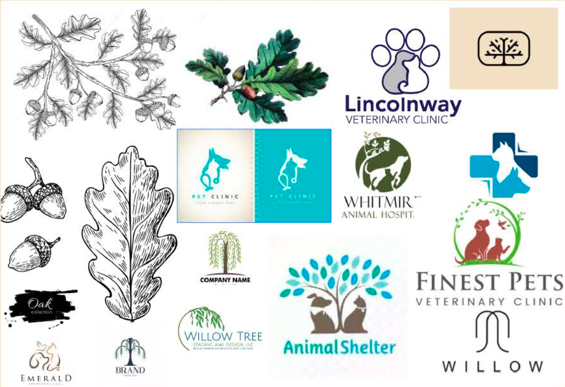
Inspirational Iconography
I collected images of vet logos to see what competitors were using, I also looked a tree inspired logo marks and oak illustration for inspiration.
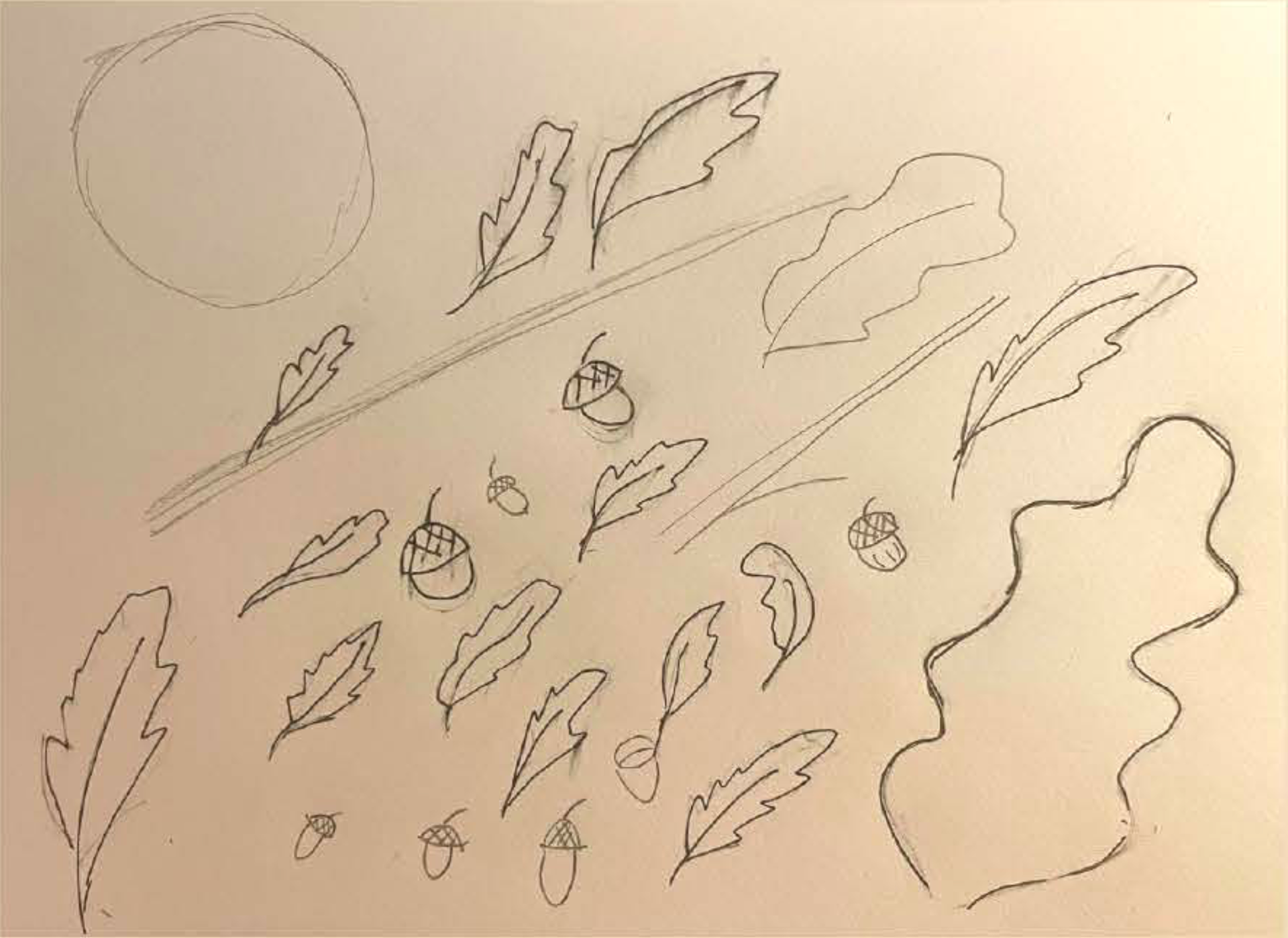
Sketches
I knew that I wanted to use oak leaves instead of a full tree because I felt it would take away from the animal imagery that I would use. So I drew different leaves to work with in Illustrator.
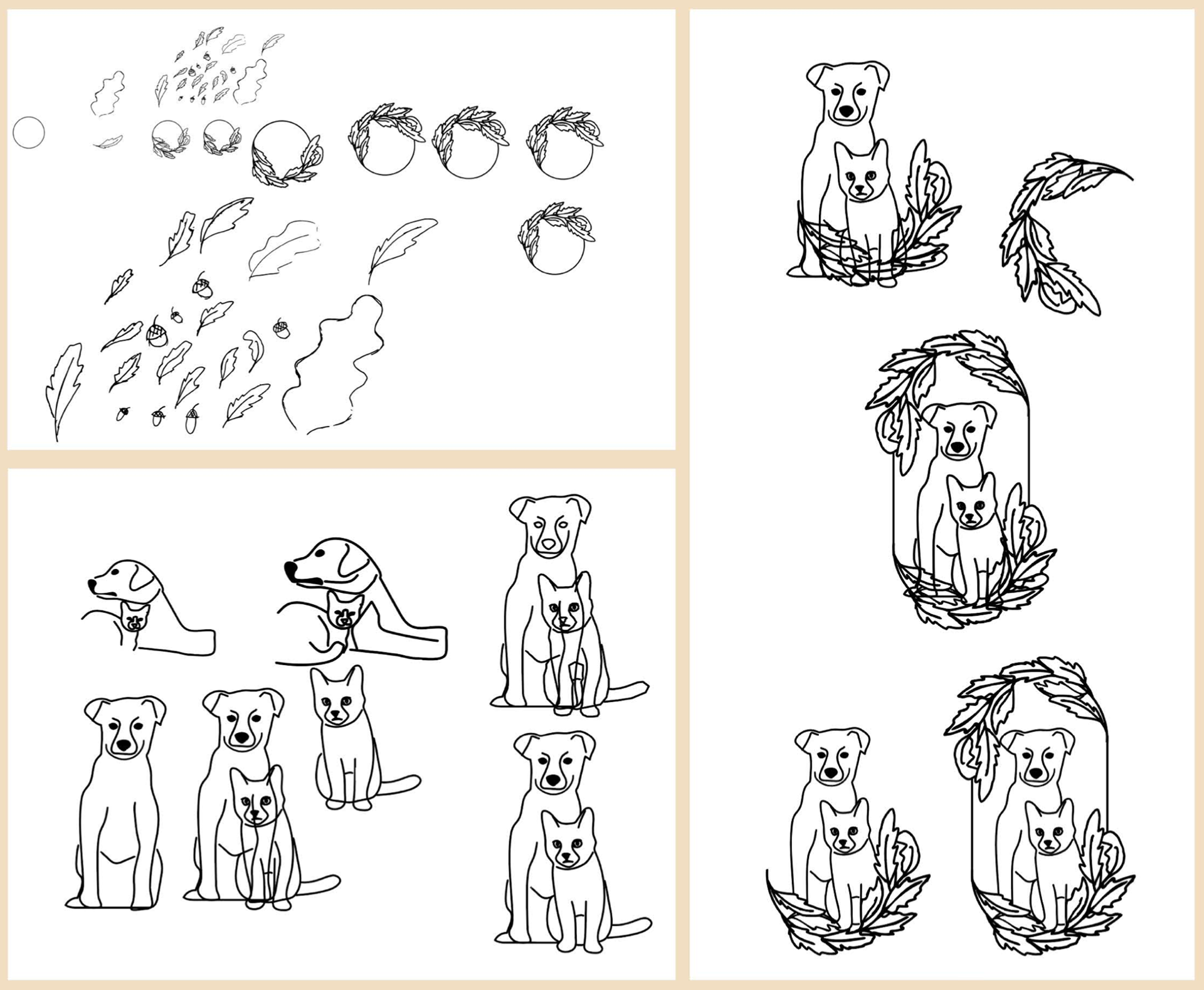
Digital Rendering
I transferred my stretches into Illustrator and created a variety of elements to create a logo mark.
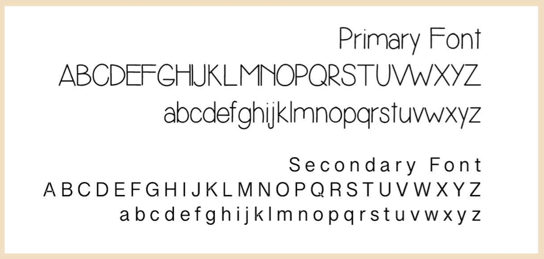
Font Choice & Placement
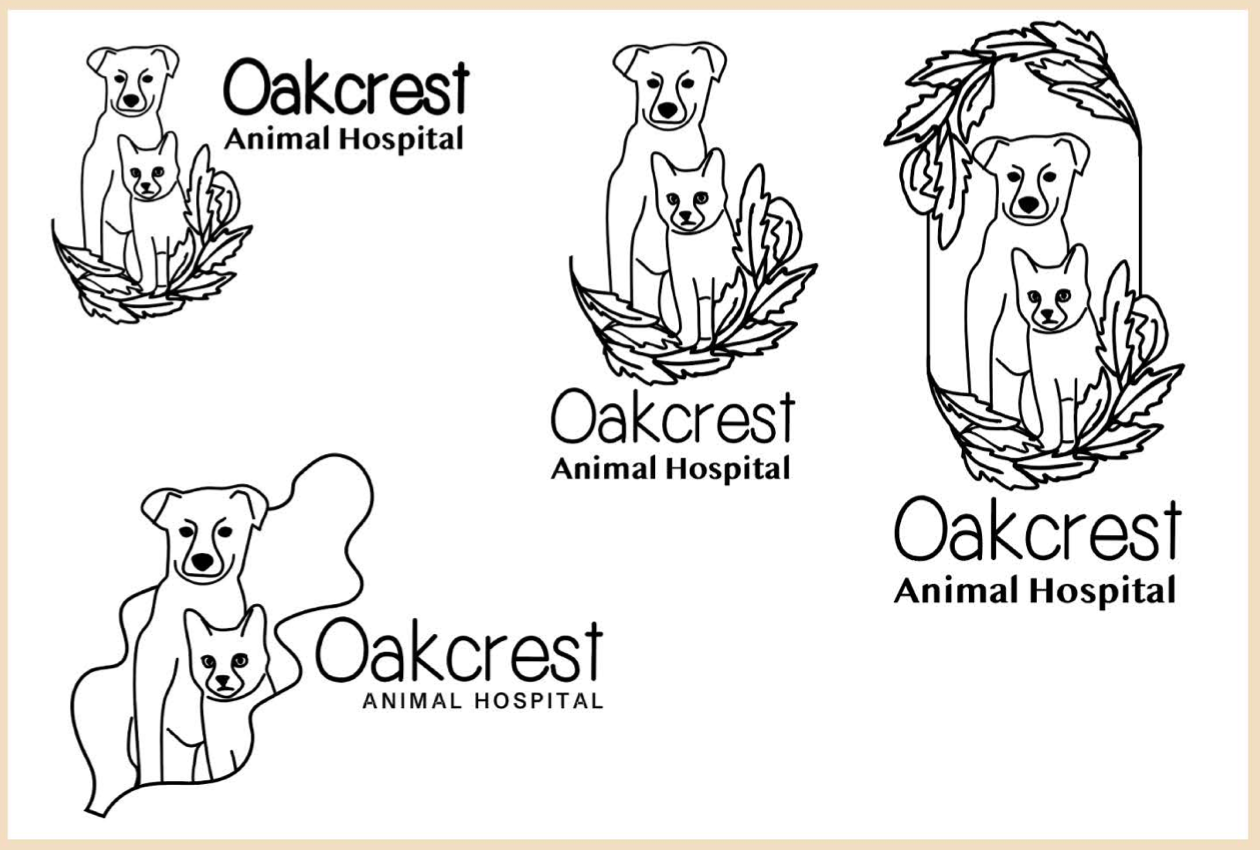
After working with the digitally rendered sketches I created several variations of logos. Then I choose a font that reflected the line style of imagery.
Logo Refinement
After choosing the font and placing, I went back to compare a variety of new options for the final logo.
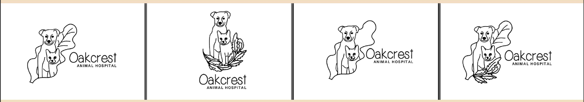
Chosen Logo Mark
With the logo mark chosen, I had to understand how to make this brand more than just a logo.
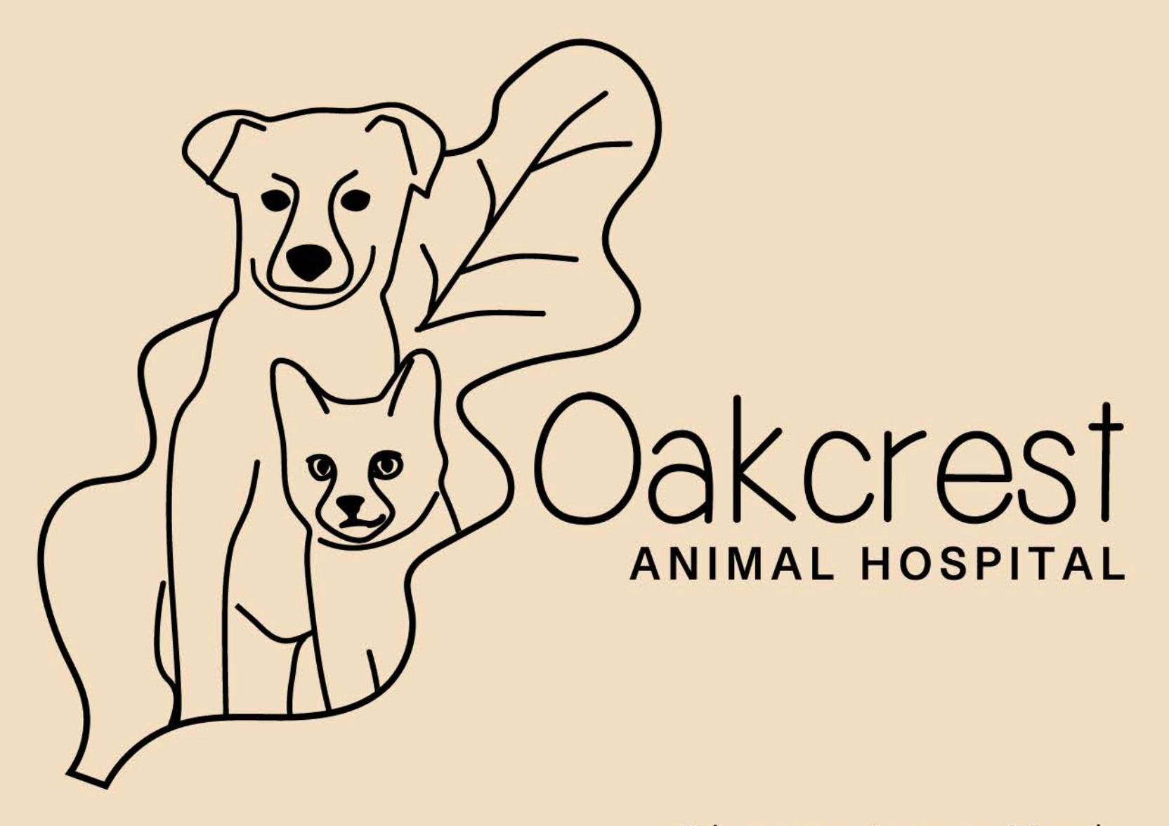
Color Choice
I choose cool relaxing colors for this animal hospital. The original logo and website did not give me a sense of the business with the color scheme. I wanted to have a light medical feel to the brand.

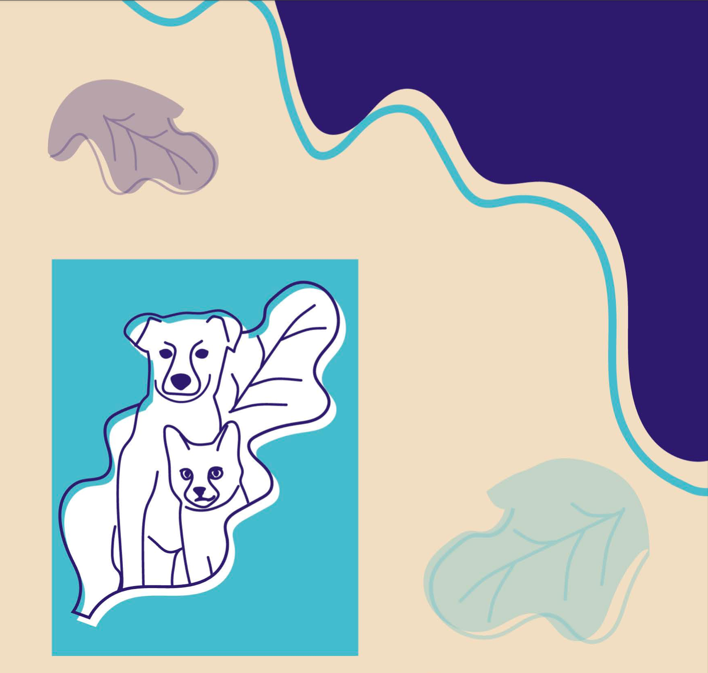
Logo, Color, and Iconography Treatment
With the logo and colors chosen, I was able to start developing a full identity for the brand. This was for how I would use the logo mark, imagery, and colors for a cohesive brand. I felt an offset line with color blocking was true to the spirit of the brand, as well as a lighter transparent leaves to offset the heavy lines.
With the established brand I created an Identity set, advertisement, and a conceptual website.
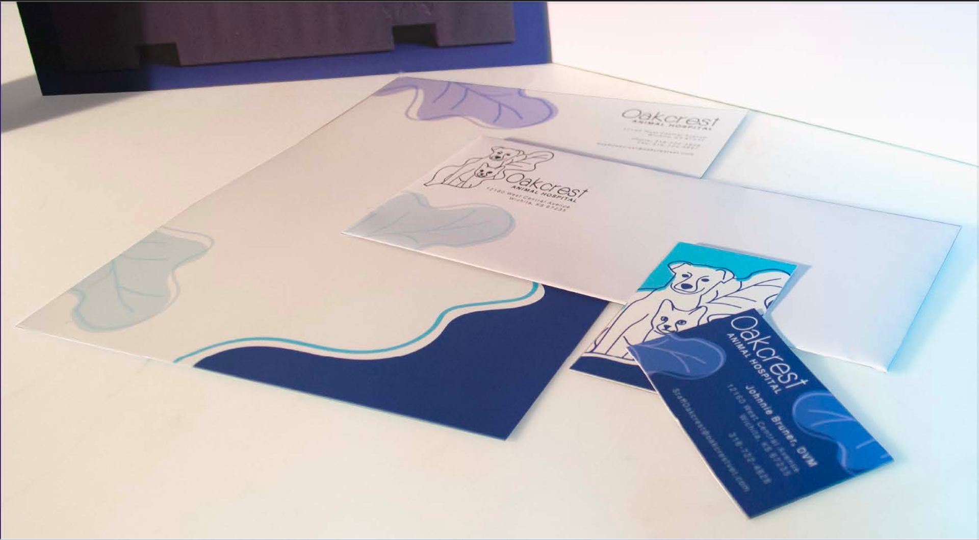
Identity Set
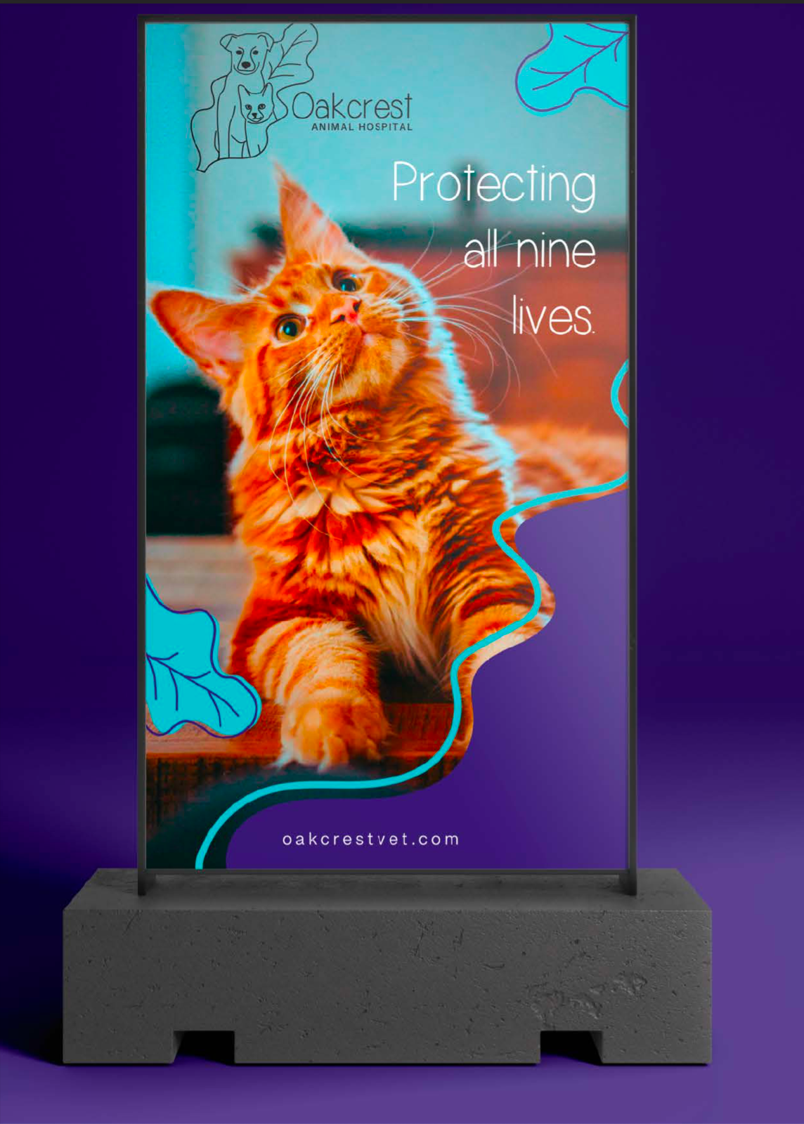
Environmental Advertisement